fabrics
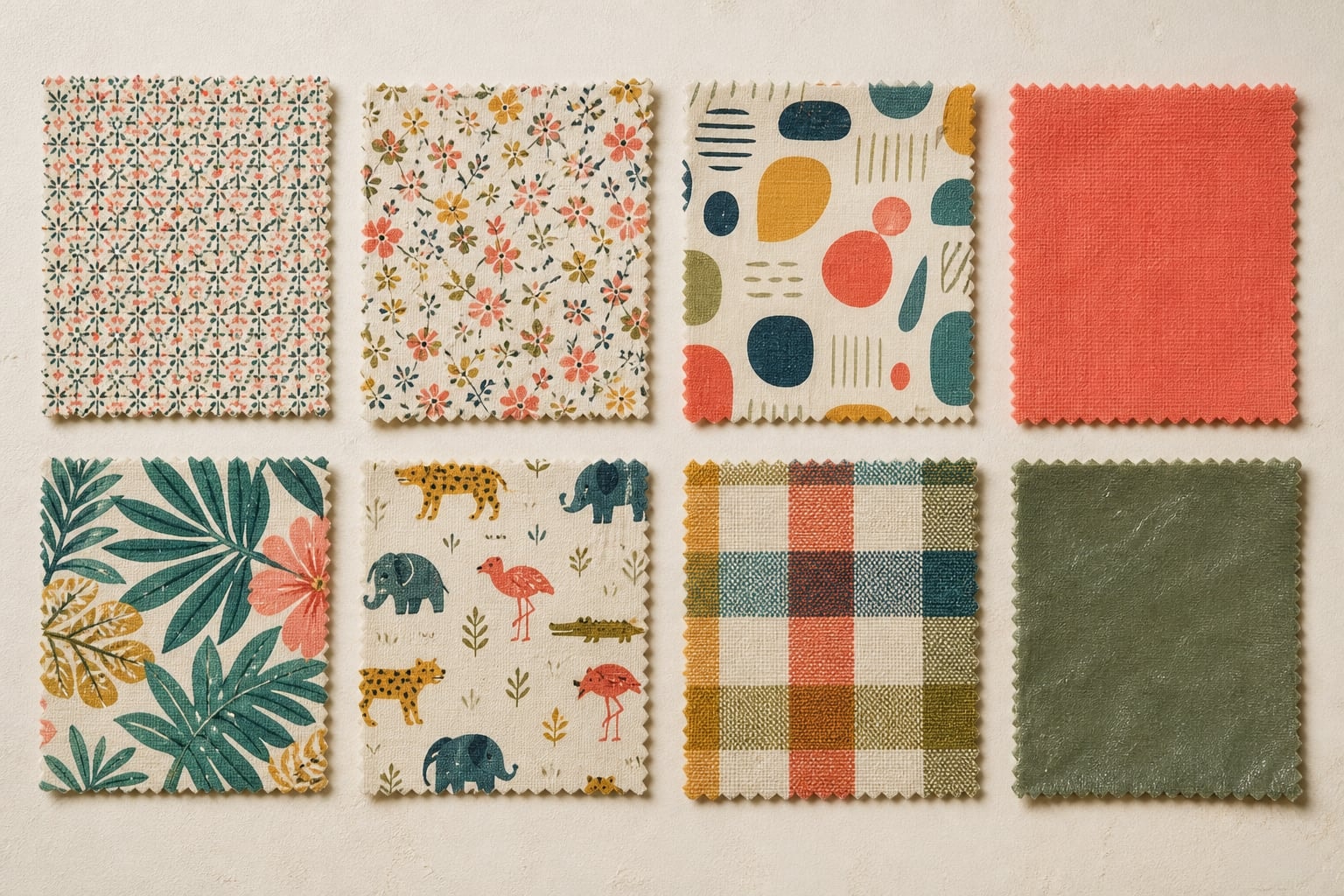
Welcome to our beautiful selection of fabrics! The 2008 category asked visitors to choose from the groups shown below and described fabrics as 100% cotton broadcloth and 45 inches wide unless noted. Period, motif, material, collection, and project categories appeared together in a broad browsing list.
- pre 1900
- 20's & 30's
- 40's & 50's
- 60's & 70's
- 80's
- japanese imports
- nature
- florals
- people
- places
- children
- food
- animals
- western
- holiday
- girls
- traditional asian
- dots
- stripes
- solids
- geometric & abstract
- vinyl & upholstery
- designers
- collections
- scrap bags & fat quarters
- swatches
The category grid organizes the page. The material below expands on how to read construction, repeat, motif, scale, and color across a varied textile selection.
Start with construction, then pattern
Before interpreting a motif, distinguish the textile structure from the surface design. A woven check is formed by crossing differently colored yarns; a printed check places color on an already constructed ground. A damask effect may come from weave structure, but a print can imitate its scrolling symmetry. Coatings may add shine or stiffness. These differences affect drape, seam behavior, abrasion, and how color changes in angled light.
When the construction is unknown, neutral language is best. Terms such as plain-weave appearance, printed motif, smooth coated face, or raised texture record observation without pretending to identify a process. The V&A discussion of early printed textiles gives useful context for the relationship between a printing method, an inked unit, and the repeat that becomes visible across cloth.
Find the repeat system
A repeat is the smallest rectangular or shaped area that can recreate the continuous design. To locate it, choose a distinctive element and scan in two directions until it returns in the same orientation. The intervals reveal the basic unit. Straight repeats align like a grid. Half-drop repeats shift alternate columns vertically, while brick repeats offset rows horizontally. Tossed arrangements rotate motifs to suppress obvious rows, and directional prints keep most elements facing one way.
Repeat structure is more than a technical detail. A strict grid can create a regular, almost architectural rhythm. A half-drop arrangement softens that regularity, and a tossed print often feels casual because the eye travels between changing orientations. The mirrored layout discussed in the playful damask reference shows how symmetry can create formality even when the motif itself is whimsical.
Describe motif without over-attributing
Motifs can be geometric, botanical, animal-based, scenic, abstract, or conversational. A conversational print uses recognizable subjects that invite the viewer to notice small visual stories. Period-inspired designs may borrow the rhythm or palette associated with an era without being made during that era. That distinction is central to responsible description: fifties-inspired identifies a visual relationship, while made in the 1950s makes a historical claim requiring evidence.
The related studies use this measured language. The fifties fabric guide looks at lively small-scale repeats, the modern pattern guide examines geometry and organic abstraction, and the western motif page considers how familiar objects become a repeat vocabulary. Each page keeps uncertain makers and fiber compositions unspecified.
Scale and the intended viewing distance
Measure both the repeat and the dominant motif. A tiny motif may read as texture when viewed from several steps away; a large scenic element may remain unmistakable but lose coherence across a narrow pattern piece. Seams, darts, gathers, folds, and pleats interrupt different parts of a design. A useful paper-window test is to cut a frame matching the approximate size of a finished panel and move it over the cloth. The frame reveals how much of the repeat can appear at once.
Directional designs add another planning question. If every motif has a clear top and bottom, pieces need a consistent orientation. A one-way layout often uses more length than a non-directional one. This is a construction principle, not a claim about any historical listing, and it applies equally to the tropical compositions on the 1960s aloha-print page and narrative western scenes.
Read color by role
A palette can be described through value, temperature, saturation, and proportion. Ground color occupies the largest field. Supporting colors connect the composition, while accents appear sparingly and attract the eye. Two prints can contain the same hue names yet feel completely different if one uses muted mid-values and the other pairs saturated accents with a dark ground.
Solid cloth can clarify those relationships. The canary yellow cotton study explains how a high-chroma yellow behaves beside neutrals, analogous colors, and deep complements. Comparing swatches in the light where a textile will be seen is more useful than relying on a screen, since cameras, monitors, coatings, and surrounding colors all shift perception.
Material-sensitive care
Unknown or older textiles should be handled as evidence, not subjected immediately to a routine treatment. Keep hands and surfaces clean, support fragile areas, limit bright light, and avoid sharp folds. The National Park Service guidance on curatorial care of textile objects emphasizes support, clean work areas, limited handling, and environmental control. Museum procedures are more exacting than everyday sewing practice, but the underlying caution is useful.
Do not infer that a method suitable for new washable cotton is appropriate for an aged, coated, embellished, or unstable piece. Condition, dyes, finishes, and previous repairs can all change the response. General advice cannot replace examination by a qualified conservator.
A durable vocabulary for fabric records
A concise description can record ground color, motif family, dominant scale, repeat type, direction, apparent construction, surface, condition, and evidence source. That vocabulary supports careful comparison without filling uncertain details with fiction. It also connects this central page to the site's specific studies of period, motif, material, and color.